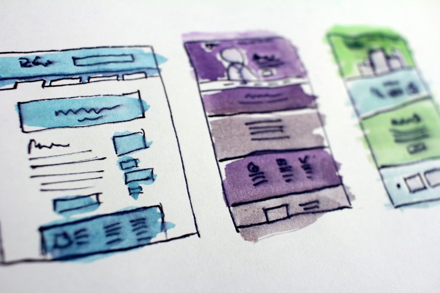

Dark mode has become a staple of modern web design, offering users a comfortable viewing experience in low‑light environments while also reducing eye strain. Implementing it yourself gives you full control over colors, transitions, and accessibility. In this guide we’ll walk through a practical, intermediate‑level approach to adding a dark theme to any web application using CSS variables. By the end you’ll have a reusable, toggleable dark mode that respects user preferences and works across browsers.
What You’ll Need
- A modern code editor (VS Code, Sublime, etc.)
- Basic knowledge of HTML, CSS, and JavaScript
- Access to the project’s stylesheet (or a new one)
- Optional: A build tool like Webpack or Vite if you work with a framework
Step 1: Define a Color Palette with CSS Variables
Start by creating a set of custom properties (CSS variables) that represent every color used in your UI. Put these declarations in the :root selector so they cascade globally. For example:
:root {
  /* Light theme defaults */
  --color-bg: #ffffff;
  --color-text: #212121;
  --color-primary: #0066ff;
  --color-muted: #f5f5f5;
  /* Dark theme overrides – we’ll switch them later */
  --color-bg-dark: #121212;
  --color-text-dark: #e0e0e0;
  --color-primary-dark: #4dabf7;
  --color-muted-dark: #1e1e1e;
}
By separating light and dark values into distinct variables (e.g., --color-bg vs --color-bg-dark), you keep the logic clean and make future tweaks painless.
Step 2: Create Light and Dark Theme Blocks
Next, use a CSS class—commonly .dark-theme—to swap the variable values. Place this block after the :root definitions so it overrides them when the class is present.
.dark-theme {
  --color-bg: var(--color-bg-dark);
  --color-text: var(--color-text-dark);
  --color-primary: var(--color-primary-dark);
  --color-muted: var(--color-muted-dark);
}
When the .dark-theme class is added to the html or body element, every variable in your stylesheet automatically switches to its dark counterpart. No need to rewrite individual selectors.
Step 3: Apply Variables Throughout Your Stylesheet
Replace hard‑coded color values with the variables you just defined. This is the most important step because it ensures the theme toggle works everywhere.
body {
  background-color: var(--color-bg);
  color: var(--color-text);
  transition: background-color 0.3s ease, color 0.3s ease;
}

a {
  color: var(--color-primary);
}

.card {
  background-color: var(--color-muted);
  border-radius: 8px;
  padding: 1rem;
}
Notice the transition on body. Adding a subtle fade makes the switch feel smooth rather than jarring.
Step 4: Build a Theme Switcher with JavaScript
Now we need a UI element—usually a button or toggle—that adds or removes the .dark-theme class. Here’s a minimal vanilla‑JS example:
const toggle = document.getElementById('theme-toggle');
const root = document.documentElement; //  element

function setTheme(isDark) {
  if (isDark) {
    root.classList.add('dark-theme');
  } else {
    root.classList.remove('dark-theme');
  }
}

toggle.addEventListener('click', () => {
  const isDark = root.classList.toggle('dark-theme');
  // Store preference (next step)
  localStorage.setItem('prefers-dark', isDark);
});
Make sure the button exists in your markup:
<button id="theme-toggle" aria-label="Toggle dark mode">🌙</button>
Using document.documentElement targets the html tag, which is a common convention for global theming.
Step 5: Persist User Preference with LocalStorage
People expect their theme choice to stick across page reloads and sessions. On page load, read the saved value and apply it before the UI renders to avoid a flash of the wrong theme.
function initTheme() {
  const saved = localStorage.getItem('prefers-dark');
  const prefersSystem = window.matchMedia('(prefers-color-scheme: dark)').matches;
  const isDark = saved !== null ? JSON.parse(saved) : prefersSystem;
  setTheme(isDark);
  // Keep the toggle state in sync
  toggle.setAttribute('aria-pressed', isDark);
}

// Run before DOMContentLoaded to minimize FOIT
initTheme();
Notice we also respect the OS‑level prefers-color-scheme media query when no explicit preference exists. This hybrid approach feels natural to users.
Step 6: Test Across Devices and Edge Cases
Testing is often overlooked, but dark mode can expose hidden color contrast problems. Use Chrome DevTools’ “Rendering → Emulate CSS prefers‑color‑scheme” option, and verify the following:
- All text meets WCAG AA contrast against the background.
- Images with transparent backgrounds adapt correctly (use
filter: invert(1) hue-rotate(180deg)sparingly). - Third‑party widgets (iframes, embeds) either inherit your variables or have their own dark mode toggles.
Finally, check performance. Adding a few CSS variables has negligible impact, but loading a large stylesheet without caching can delay the theme switch. Make sure your CSS is minified and served with proper cache headers.
Common Mistakes to Avoid
1 Hard‑coding colors after the toggle. If you forget to replace a color with a variable, that element will stay stuck in the light palette, breaking visual consistency.
2 Forgetting the transition property. Without it the switch feels abrupt and can be disorienting.
3 Not handling the prefers-color-scheme media query. Ignoring the user’s OS setting can make your site feel out of sync with the rest of their environment.
4 Storing the theme as a string “true”/”false” without parsing. This leads to bugs when you later compare the value as a boolean.
5 Applying the class to the wrong element. Adding .dark-theme to a child element only affects that subtree; the global variables won’t cascade.
6 Missing contrast checks. Dark mode often reveals low‑contrast text that was acceptable on a light background.
Tips and Tricks
• Use prefers-color-scheme directly in CSS for a no‑JS fallback: @media (prefers-color-scheme: dark) { :root { --color-bg: var(--color-bg-dark); … } }.
• Group related variables (e.g., --color-bg, --color-bg-muted) to keep the palette organized.
• Leverage calc() for dynamic shades: --color-primary-light: calc(var(--color-primary) + 10%);.
• If you use a CSS pre‑processor, generate the dark block automatically to avoid duplication.
• Add a “system” option in your UI that clears localStorage and re‑evaluates the OS preference.
• For images, consider providing a dark‑mode‑specific SVG version or using CSS mix-blend-mode to adapt colors.
Frequently Asked Questions
Do I need a CSS pre‑processor to use variables?
No. CSS custom properties are native to modern browsers and work without Sass, Less, or PostCSS. However, a pre‑processor can help generate the dark block or create fallback values for older browsers.
What about browsers that don’t support prefers-color-scheme?
For legacy browsers you can default to the light theme and rely on the manual toggle. Optionally, add a polyfill that reads window.matchMedia and applies the class manually.
Can I animate the theme change?
Yes. Adding transition: background-color 0.3s, color 0.3s; to the body (or any container) creates a smooth fade. For more complex animations you can use the CSS @property rule, but support is still experimental.
Conclusion
Implementing dark mode with CSS variables is a clean, maintainable solution that scales from tiny personal sites to large‑scale web applications. By defining a robust palette, swapping values with a single class, and persisting user choice, you give visitors a polished experience that respects both aesthetics and accessibility. Follow the steps, avoid the common pitfalls, and you’ll have a reliable dark theme ready for today’s users—and future ones who expect it as a default option.
Photo by Pankaj Patel on Unsplash